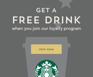
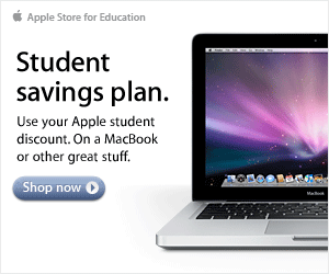
 As businesses rush around searching for new ways to advertise their company and increase product awareness, many brands seem to forget that web banner ads are still a key form of online advertising. Banner ads are one of the most prolific forms of display advertising used in the online World today. Almost every company utilizes them in some form because they are easily measurable, affordable, and effective.
Of course, like any form of marketing campaign that you may choose to pursue, the success of your banner ads will depend on how engaging, attractive, and enticing they are. For your banners to work, they need to be able to lure visitors to click on them and visit your landing page. Because of this, a good web banner should create not only a strong interest in the user to see what's happening on the advertising page, but also the potential to convert visitors into leads and buyers.
Since the Internet marketing era began, banner ads have been an effective and popular way to publicize on the web. They come in many shapes and sizes, and are often flexible enough to ensure that you can customize them to the specific needs of your campaign. Unfortunately, the effectiveness of banner advertising is no secret - and as such, display advertising efforts have begun to flood the both the online and offline environment, making it easier for most customers to ignore the standard ad. This means if you want to benefit from more conversions, you need to come up with new ways of grabbing attention and making your banner stand out. Below outline 3 tips for designing killer banner ads.
1. Keep It Short and Simple (K.I.S.S)
According to Statistic Brain, the average human attention span in 2015 reached an all-time low of 8.25 seconds. On top of that, 17% of Internet page views last for less than 4 seconds - which means that you have a minuscule amount of time in which to grab your intended customers' attention and draw them into the sales funnel.
If you want to get your message across to your audience and make sure that they get the right impression of you before they click away to something else - it's a good idea to ensure the design, concept and wording on your banner ad is clear, simple and straight to the point. If your viewers are presented with a block of boring text or they can't understand your message, then they're going to ignore your banner completely. This means using as few words as possible to begin with. Don't worry - you can get into more content when you're further into the sale.
In the same vein - make sure that you do everything that you can to avoid distractions. One of the most common mistakes banner designers make is trying to draw the viewer's attention to too many things at once. The primary focus of your banner ad should be to tempt the reader into clicking through to your landing page. Nothing less - nothing more.
2. Use a Great Tagline
Just like coming up with great titles is an important part of writing great blogs or articles, your banner should have a memorable and curiosity-provoking tagline that instantly engages your target market and makes them want to know more about you. Make sure that you use language that is likely to trigger an emotional response in your viewer. If you can be professional and provocative at the same time - then do that. Include words like "New" or "Latest Technology", or entice your audience in further with things like "Free", "Save", or "Special offer".
If your tagline is catchy enough, you should be able to work it so that even users that don't immediately click on your banner advertisement will continue to remember the words you used to such an extent that they may seek it out themselves later.
3. Emphasize the Benefit for Your User
People don't want to click on a banner or advertisement because it's good for you - they want to do it because it promises something useful for them. Explaining the fancy features of your product is all well and good - but the thing they really care about is how those features will benefit them. For an effective banner ad, leave out the details and emphasize what your viewers stand to gain by clicking on your banner and learning more about your brand.
Everything from the language you create, the font you use, and the images that you provide should grab your viewers' attention and show them that you have something valuable to offer.


