Guest post by Charlotte Ahlin.
 Everything from the shiny new Apple TV to the lowliest flashlight app on your phone has a brand. Branding is how companies stand out: it’s your name, your identity, your blueprint. But what happens when you change your look overnight? And we’re not talking about a little fluffing here - we’re talking a full fledged head-to-toe makeover. Well, then you pull an Uber and totally rebrand your image.
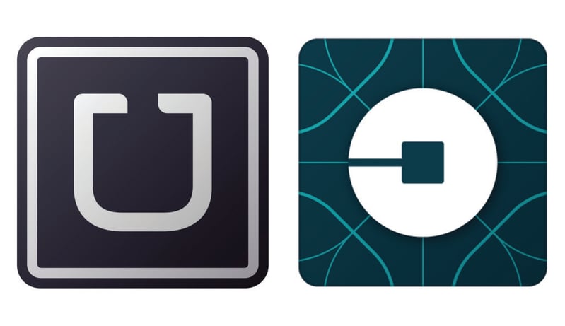
If you haven’t noticed already, Uber has completely revamped their look: out with the old black and white “U,” and in with a totally new icon in deep teal (if you’re in the U.S., anyway). So, good luck trying to find the Uber app this weekend at 4am.
Uber has emerged from its rebranding cocoon as a colorful, slightly confusing butterfly. Their new design includes country-specific color palettes for the 68 countries that Uber operates in, which is pretty damn cool. But the big idea behind their reborn identity is computer bits and atoms. According to Uber’s website, they’re all about using the idea of computer bits to put “technology front and center,” as well as the atom to bring out the “human side.” The new icons for the rider app and the partner app are meant to represent a stylized bit and an atom. Because, you know, when you think of the tiny particles that make up all matter in the Universe… you think of ordering a car service on your phone.
Or at least, Uber hopes that you will.
Uber’s hardly the first company to overhaul their whole look and feel: remember when Apple laptops had an upside down logo? Or when the Twitter bird had that little tuft of hair? Or when Google unveiled its simpler, chubbier new logo? Rebranding is a necessary part of keeping your company alive and relevant. People will keep coming back if they can recognize your brand, but they’ll also notice if your whole vibe starts to feel dated.
So why does Uber’s rebrand stand out among the rest? Well, most companies hire an outside expert to handle their new design concepts, but Uber’s founder and CEO, Travis Kalanick, took on the project himself. He and his team spent over two years coming up with the bit-and-atom idea, and the multi-country color scheme. The final look was actually inspired by one of the communication designer’s bathroom tiles.
Besides this hands-on design approach, Uber is also putting more of an emphasis on their other services. They’re not just “everyone’s private driver,” they also deliver packages and even food. On the one hand, their new rebrand seems like a huge shift - and one that promises to focus on serving the 400 cities in Uber’s domain. On the other hand, Uber’s already gotten into trouble for overworking and underpaying their drivers, and their sleek new “bits and atoms” persona doesn’t seem any more focused on the people behind the wheel.
Love it or hate it, the Uber rebrand has certainly done what any good rebrand is supposed to do: it’s got everybody talking about Uber. Now, is a stylized deep teal “computer bit” icon going to be more appealing when you need an UberX to make a pizza run at two in the morning? Maybe not, but Uber’s certainly gone bold with their new brand, and they’re hoping you’ll like it.


