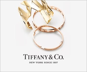
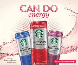
Establishing your own unique personality and brand identity online is a crucial part of managing a successful digital marketing strategy. Although there are various areas that you may need to focus on when it comes to maintaining brand identity, one of the primary things you'll want to concentrate on - is how you're going to distinguish your banner advertisements from those of your competitors. According to Business Insider, you're already fighting against tough odds if you've decided to use banner advertising as your primary form of online representation, but the truth is that poor design is often the cause of poor results. If you know how to make your banner distinct, innovative, and interesting, you can prove the statistics wrong and achieve a fantastic new rate of traffic and conversions. Following are four ways that you can optimize your banner advertisement design and leave your competitors in the dust.
1. Stay Simple and Attractive
First of all, start by removing every last bit of clutter from your banner, so that you're left with nothing but the absolutely essential information. Readers quickly become distracted by pieces of unnecessary text, or random images, and the more mess you have on your banner, the less professional you're likely to appear. Your primary aim should be to design a banner advertisement that's easy to look at, and simple to concentrate on. This means choosing a clean layout, with easy-to-read fonts using optimized colors. Too many designers make the mistake of trying to cram all of the information they have about their product or service onto a single banner, but remember that your banner should be the thing that tempts the reader to learn more about you. Having too much data in one small area can mean that your core message is lost to the viewer, and that may mean that they feel uncomfortable clicking on your ad.
2. Use The Right Colors
Choosing the perfect color for your advertisements can be a difficult task, as most people not only want to have the right psychological impression, but also need to adapt their marketing to fit with pre-existing logos and color schemes. Studies have found that there is a significant connection between the psychology of color, and the success of marketing or branding, because different hues make your visitors feel different emotions. Your goal should be to choose colors that give the right representation of your brand, but also make your customers feel emotions that fit with what your product or service is, and what your company is actually about.
If you're unfamiliar with the concept of color psychology, there are plenty of resources online that should provide extensive information on which color provokes which reaction. For example, the color emotion guide should give you a great starting point to determine whether your banner colors fit with what your company and your product stands for.
3. Always Include 3 Crucial Components
The primary function of a banner ad is to deliver new traffic to your website, and increase awareness of your brand. Because of this, your standard banner advertisement will have three basic components:
- The first is the company logo - an icon that you use to define your brand and build an identity for your company. On any advertisement, your logo should be visually dominant, but it shouldn't overwhelm your call to action or value proposition.
- The second component is the value proposition - this is the thing that shows off the product or service that you're providing to people, and it should draw attention to itself with attractive benefits for the customer or viewer.
- Finally, you'll have the call-to-action - a button or piece of text that encourages the viewer to take the next step on their buying journey and be transported through to your landing page. The call to action should be the focus point of your entire advertisement, and should be engaging enough to tempt viewers to click on it.
4. Pinpoint Perfect Copy
The fourth and final way to distinguish your banner ad from the advertisements of your competitors is by using copy that truly speaks to your audience. When you're writing copy for anything to do with your brand, website, or company, you'll need to keep in mind the purpose and goal of what you're trying to achieve. Your copy should be simple and easy to follow, but it should also address the concerns of your target audience, and speak to them in a language that they resonate with and understand. Avoid flickering or flashing designs and choose copy that is strong and engaging.
Remember, even the smallest changes can make huge differences when you're trying to create a truly amazing banner advertisement. You may also find that testing different designs is useful when you're getting started, as it will allow you to compare strategies and find the approach that works best for you.


